Turbulence, turmoil & uncertainty are upon us; change is the only constant in the universe. Be prepared; forewarned is forearmed.
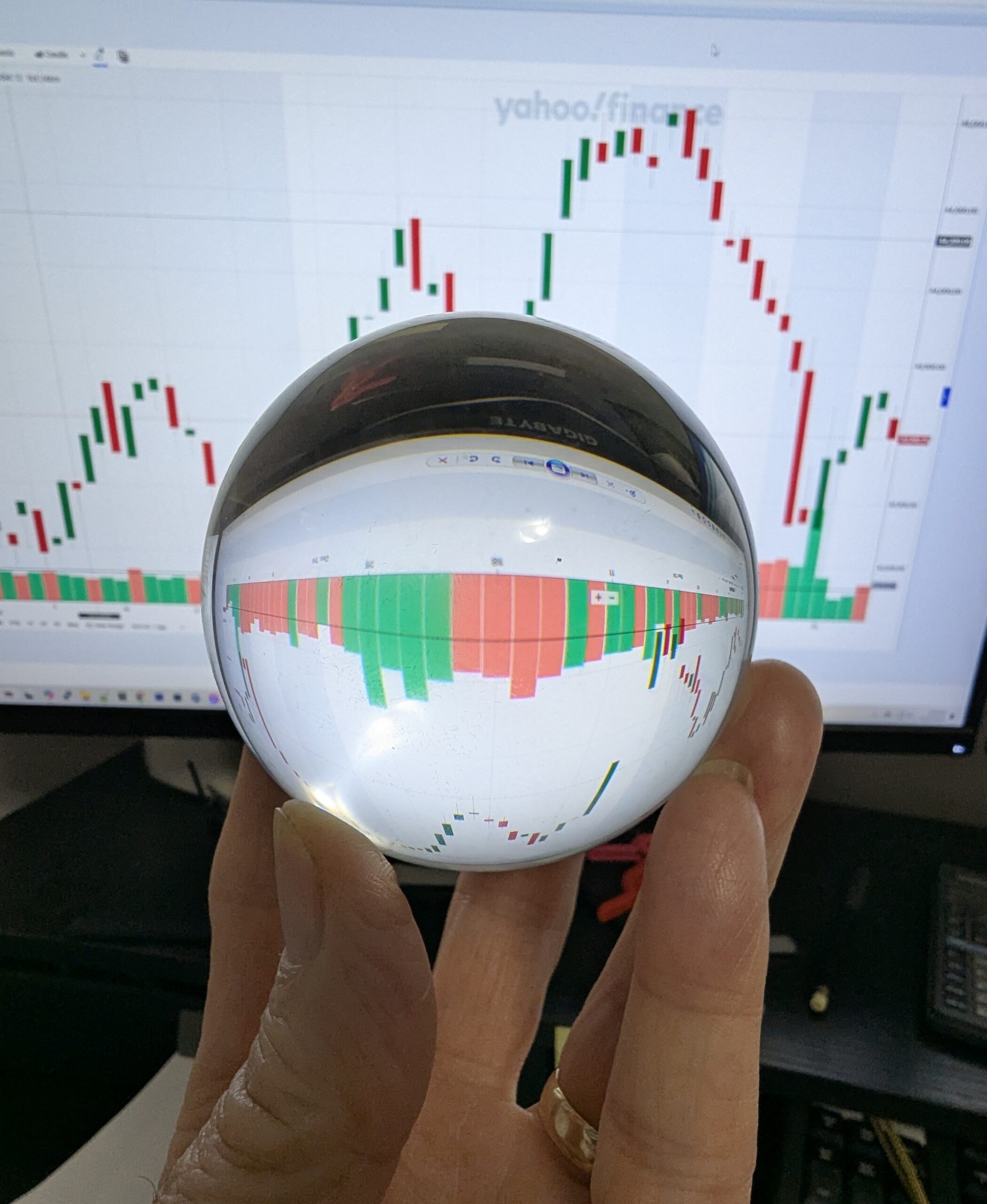
My crystal ball is no help in predicting what lies ahead, however, there are sign to read if you know where to look and recognize what you see. What I see is a significant change in course and not for the better. If you have RMDs to consider you may want to follow along.
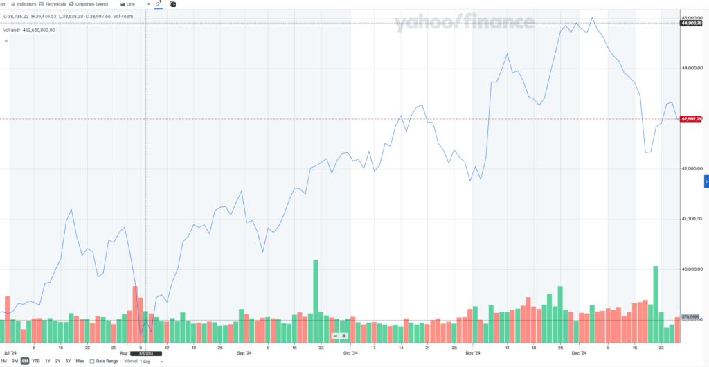
The traditional line chart or mountain graph to depict the stock market is based on closes, daily, weekly, hourly; whatever time period is being used. This is a map of places stopped along the way, but tells no story of how that stop came about. This is a myopic view of the market, or sector, or individual stocks.
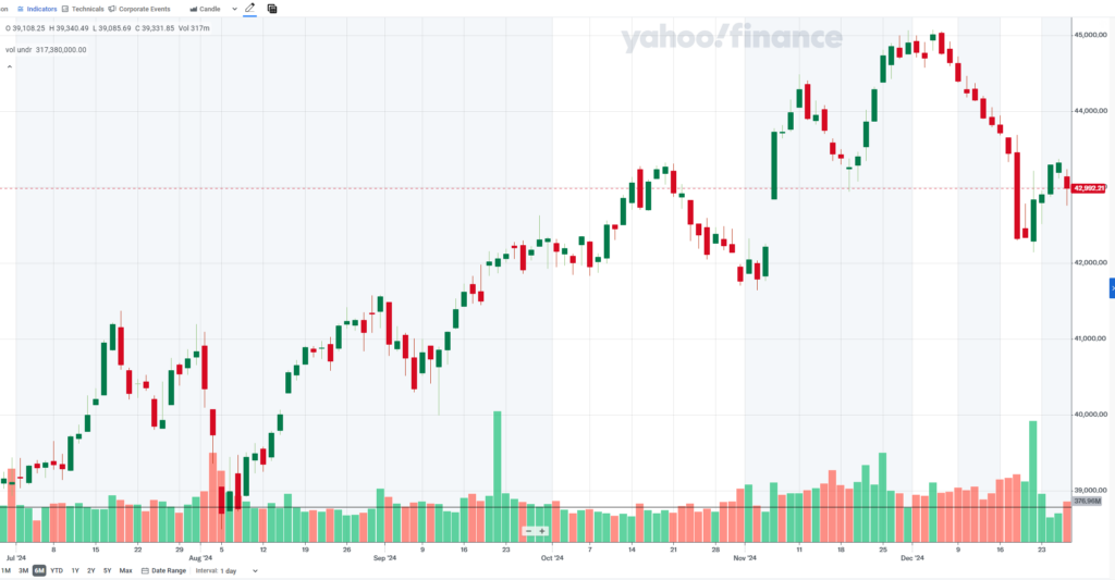
The chart above is the standard line chart, the lower is the candlestick view, both for the past 6 months. Which tells you more? Most stock displays, regardless of chart type, use the bottom to provide bar charts to show volume for the period. I’ve added a black line across the volume at roughly the high point average through a majority of the period. Note that from early November the volume has been considerably higher than the average and for a much longer time than anytime prior. This is significant, we will come back to it later.
In the 18th century Munehisa Homma, a Japanese rice trader from the Ojima Rice market in Osaka noticed that market prices were influenced not just by supply and demand but also by traders’ emotions. Homma began documenting price movements using what we now know as candlestick charts. These charts provided a visual representation of price changes over time, capturing the opening, closing, high, and low prices for each trading period.
The primary intent behind candlestick charts was to understand and anticipate market sentiment. By analyzing patterns in price movements, traders could gain insights into market psychology, including fear, greed, and other emotions that drive trading decisions.
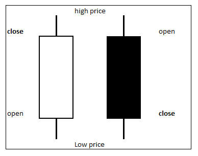
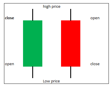
Here are the two basic candlestick displays, colored or hollow. A green or white (hollow) candle indicates the market went up, the close was higher than the open. The red & black candles are the opposite, the close is below the open.
The wicks, tails, shadows that rise above & below the body of the candle represent high (above) and low(below) range extents of the price during the period. Long tails can indicate the direction the market wants to go.
The size of the candle body shows market sentiment. A large body shows strong market direction up or down. A very narrow trading range has the open and close being almost the same, this is a doji or spinning top it shows indecision, buyers and sellers are undecided. Hammers and shooting stars signal turning points have small bodies with long rising tails; think of Thor’s hammer sitting on the ground handle up, it’s the base and not going any lower. When this occurs at a peak it’s the final hurrah, a shooting star.
There are several different multi-day patterns, bullish and bearish engulfment, 3-soldiers or 3-crows. There are several blogs and YouTube channels for more basic information on candlesticks for trading.
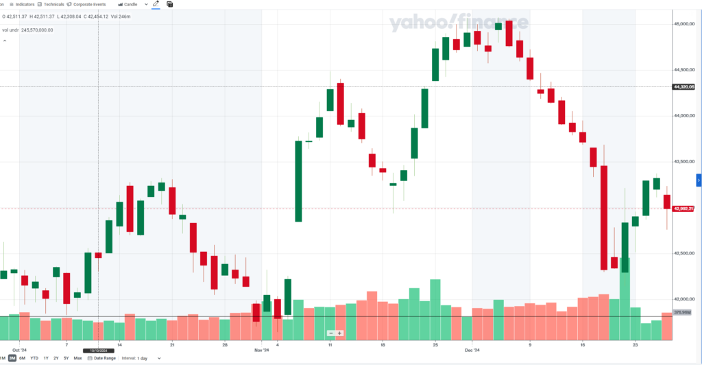
Notice in early November, the chart is forming a bottom, a floor of support. On the 5th, election day it was a decent up day with light volume. The 6th was not only a very strong up day, it also opened way above the previous day’s close. This is a gap, the larger the gap the stronger the market sentiment; this was a huge gap up to open and then a very strong day. This is showing exuberance and giddiness in the market.
So, about now you may be asking if there’s exuberance and giddiness in the market why the dire outlook? Put simply, there’s more to the story.
An indicator used by one of the worlds’ greatest traders was given his name, although he did not create the indicator he just uses it. It’s called the Buffet indicator after Warren Buffet. It takes the entire U.S. stock market value and divides that by the Gross Domestic Product to come up with a value. The value is represented as either a number or a percent showing over valued or under valued state of the market.
Buffet has unloaded millions worth of stock, citing the market as being overvalued according to the Buffet indicator when it was at 140% (1.4); currently it is over 203% (2.03), which is way overvalued.
We can look at the world and see conflicts, formerly stable governments being unstable & failing. We see storms and flooding at 100 year and unprecedented levels. We see migration stressing governments and communities. We have an incoming administration promising change on a massive scale, possibly unleashing chaos.
Smart money & institutional investors see all this too and are concerned about protecting what they have and getting out while they can. The markets don’t like turmoil, conflict, natural disasters, supply chain disruptions or political upheaval, but those appear to be headed our way.
Volume has been extremely high for nearly two months, whether the prices were going up or going down. Remember every trade has a buyer and a seller. If you notice the ascent at the end of November were large up days with small gaps up; looking at the candles for the descent before Christmas looks more orderly, stair-stepping down, but both have similar volumes, smart money playing the markets in both direction and unwinding their positions in the process. They can’t do it too fast or it will spook and panic the markets which would cause a big crash, depriving them of profits, better to sell to the unwitting & ever hopeful at higher prices before the fall.
My prediction is a slow drift lower with intermediary peaks and valleys on the way down, until the bottom falls out, probably mid to late spring if it’s going to happen.
What Can You Do?
The usual advice applies, cut back on expenditures were you can, avoid unnecessary spending, save cash. If you are in the markets avoid risk as much as possible, consider cash & cash equivalents.
For those 73 and older with retirement accounts this warning has an extra layer of urgency. The market is near all-time highs. The Buffet indicator shows that the markets are way overvalued, meaning little room to go up and lots of room to go down. The end of the year is a few days away when the baseline for RMD calculations gets locked in.
For those unfamiliar with RMDs, Required Minimum Deductions, it’s the way for the government to make retirees deplete their retirement account by the time they die. Each year they have to withdraw a minimum amount from their retirement account. The amount is determined by how much is in the account, divided by a factor tied to their age, each year the factor used as the divisor gets smaller so the RMD gets larger. This leads to tax implications and withdrawal strategies that aren’t germane for this discussion.
What is important to note here is that the amount used for RMD calculation is based on what is in the account on Dec. 31st at year end. It doesn’t matter what happens during the following year to the account; RMD is based on prior EOY value. If the account drops significantly during 2025 there will be less money in the account to withdraw or use to pay taxes on the required withdrawal.
There are no rules about how or when to take RMDs, just that the are calculated using the Dec 31st value. Many people withdraw monthly or quarterly; this year it may be wise to take the entire RMD early in the year while the market is up, just in case the market does tank. I’d rather miss a few dollars in profits if it means holding onto my nest egg.
Leave a Reply